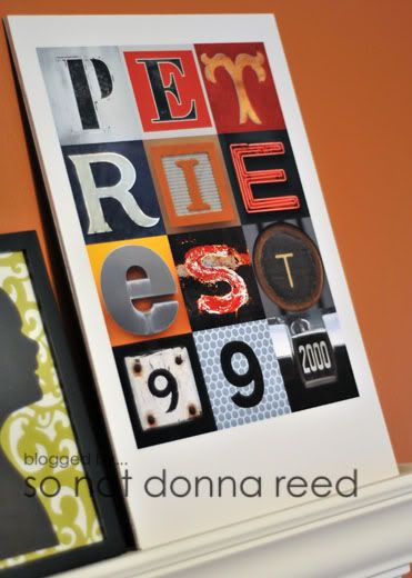
If you've spent any time at all rambling around blog land (and let's face it, if you're here...you've rambled) then you've probably seen family wall art items like this one before...
The first one I stumbled on was made by Amy at My 3 Monsters. (You can find hers under her "Favorite Projects" tab.) I immediately {loved} the fresh, funky and modern take on the traditional family name theme. Since then, I've seen several different versions of the same on at least 5 different craft blogs. Of course, I had to make one of my own.
Add me to the list of people singing the praises of Leo Reynolds' Flickr Photo Stream. He's been kind enough to allow us all access to his photos, free of charge! Please, PLEASE, don't be the person to ruin this for the rest of us by taking advantage of his kindness and using his photographs to make art for profit...b/c then you would really suck. Just sayin'.
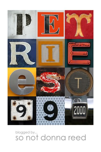
The first thing I did was go through the photos and choose the ones I wanted to use. Just to warn you ~ this part of the process could take {forever} if you're not the type who can make a quick decision. There are just so many photos to choose from! I downloaded the "large" sized files for the photos I wanted to use and saved them to my computer. I did a little thinking and decided that I wanted to print this out as an 12x18, so I opened a new file in that size in photoshop. Then I did the good ole' drag & drop onto the canvas, adjusting the size of each photo and realligning everything until all of the letters & numbers were equally-sized and evenly placed. That took a little time, but once you've got the first row down it does get quicker & easier. If you're using a program that allows you to show a grid on your project as you're working, USE IT. That was a {huge} help in keeping things straight and even.
Once I was finished lining everything up, I combined all of the layers except the background, then I resized that layer to 85%, which left a nice white border all the way around the letters. This is what I ended up with.
Being that I like to change out our art on a regular basis, I chose not to frame this project. It's just easier for me to take things down and move them around, or set them aside for a while, if I can stack them neatly and not have to deal with finding a place to store them in their frames. All I did was mount the photo to a piece of foam core board using spray adhesive. Super quick & easy!
I'm thinking they'd make great {gifts} for weddings, house warmings, etc. ~ and I can't wait to make more of them!


absolutely LOVE this Sarah! I'm off to *waste* time looking through those flickr pics! Of course, that also gives me the idea to find my own "letters" and photograph them :)
ReplyDeleteI love this! =) it looks so good -- I have SEVERAL weddings I am attending or in this year and I think this would be neat to give to someone =) thanks for the idea!
ReplyDeleteThis is so awesome! Can these be printed out from Snapfish or something as well? I'd like to make one as a gift and one for myself...that's awesome!
ReplyDeleteThanks everyone! :)
ReplyDeleteLP - I had mine printed at Costco, but whatever lab you normally use should be just fine. Remember - you're going to choose your print size when you start to design your wall art - so make sure that the print size you want is available through your lab - If they don't offer the size you've chosen for your design you'll end up losing parts of the design when it's cropped to fit onto another size print.
Thanks Sarah! I can't wait to try this out :)
ReplyDeleteI love your wall art. I had heard of the Leo letters, but had lost track of the info. glad to find it on your blog. I'm going to give it a try.
ReplyDeleteSO SO CUTE!! Thanks for the shout out! LOVE your blog!!
ReplyDeleteAmy